
Site audit of catalenahatters.com
Hats made by hand, sold through a storefront built in 2018.
Catalena Hatters has the photography, the story and the product to sell a $389 to $999 custom felt hat online. The store gets in the way: a hero with no message, prices set in a gold that fails contrast, one small photo per hat, a twelve-field configurator with no lead time, and a theme that predates lazy-loading and structured data.
This report covers three passes. Design looks at what the pages communicate before anyone reads a word. Experience follows a shopper from the homepage to the cart. Search covers what Google can crawl, understand and rank. Every finding names the screenshot it came from.
Rendered in Chrome at 1800px and in Playwright Chromium at 390 by 844. Thirty pages crawled and parsed. Structured data checked in the rendered DOM. Core Web Vitals are in-browser measurements because the PageSpeed Insights quota was exhausted on the day. The browser session sat in the Philippines, so prices rendered in pesos, which exposed a real currency bug.
- Design 6 of 10 Strong photography and a fitting palette, undercut by tiny hero type, failing gold contrast and low-resolution product images.
- Experience 5 of 10 The configurator works but is long and unexplained. No lead time, shipping, returns or reviews anywhere in the purchase path.
- Search 4.5 of 10 Shopify handles the crawl basics. No JSON-LD, SKU-only titles, truncated descriptions, empty collections and an empty blog.
- Platform
- Shopify, Turbo 2.0.10
- Theme assets last built
- September 2018
- Apps in the page
- Bold Options v1, Boost filter, accessiBe, Hulk Forms
- Products, collections, pages
- 212, 50, 16
- Blog posts
- 0
- Pages with JSON-LD
- 0
- Images lazy-loaded
- 0 of 42
- Scripts per page
- 68
- Gold on cream contrast
- 1.9 to 1
Where to start
Eight changes, ranked by how much revenue they touch against how hard they are. The first six can ship inside a month on the current theme.
-
Tell buyers when the hat will arrive
A made-to-order hat at $389 or more has no production time, shipping, returns or guarantee anywhere near the price. This is the single biggest leak.
Product page findings -
Fix the gold
Prices, links, breadcrumbs and the Add to Cart button use a gold that measures 1.9 to 1 on cream. Every one fails WCAG AA.
Contrast specimen -
Give the desktop hero a headline and a button
Mobile already shows copy and Shop Felt Hats. Desktop shows two photos with 22px labels and nothing to click.
Hero finding -
Reshoot the hats
The main product image is 571px wide. The 20X variant image is 320px. One photo per hat, on three different backgrounds.
Photography finding -
Add JSON-LD structured data
Not one page has it. Product, Offer, BreadcrumbList and a LocalBusiness block for the Bryan shop are the minimum.
Structured data -
Rewrite product titles and descriptions
Page titles like 7104, 1022 and A73122 carry no keyword. Meta descriptions are cut at 320 characters and reused across straw hats.
Titles and descriptions -
Fix the search price bug
Search results show ₱389.00 while the collection shows ₱24,800.00 for the same hat. Any non-US shopper sees a 60 times discrepancy.
Search finding -
Plan the theme upgrade
Turbo 2.0.10 has no lazy-loading, no image dimensions and throws JavaScript errors on every page. Bold Options v1 and Shopify Product Reviews are both legacy.
Technical debt
Design
What the pages say before anyone reads them. The brand system is sound. The way it is applied on the live site is where the problems sit.
What is working
The palette is a warm cream ground, walnut body copy, ink headings and one hat-band gold for action. Old Standard TT carries names in uppercase, Lora carries reading, Oswald carries anything you scan or click. That pairing suits a family hatter founded in 1983 and needs no replacement.
The in-store photography is the site's best asset. The hat wall, the blocking room and the steaming bench carry the story on their own, and the full-bleed bands on the homepage use them well.
Square corners, hairline rules and no drop shadows keep the pages honest. The product grid is consistent and the footer is clean.
- Cream ground
- Parchment footer
- Walnut body
- Ink headings
- Bark top bar
- Hat-band gold
Findings
-
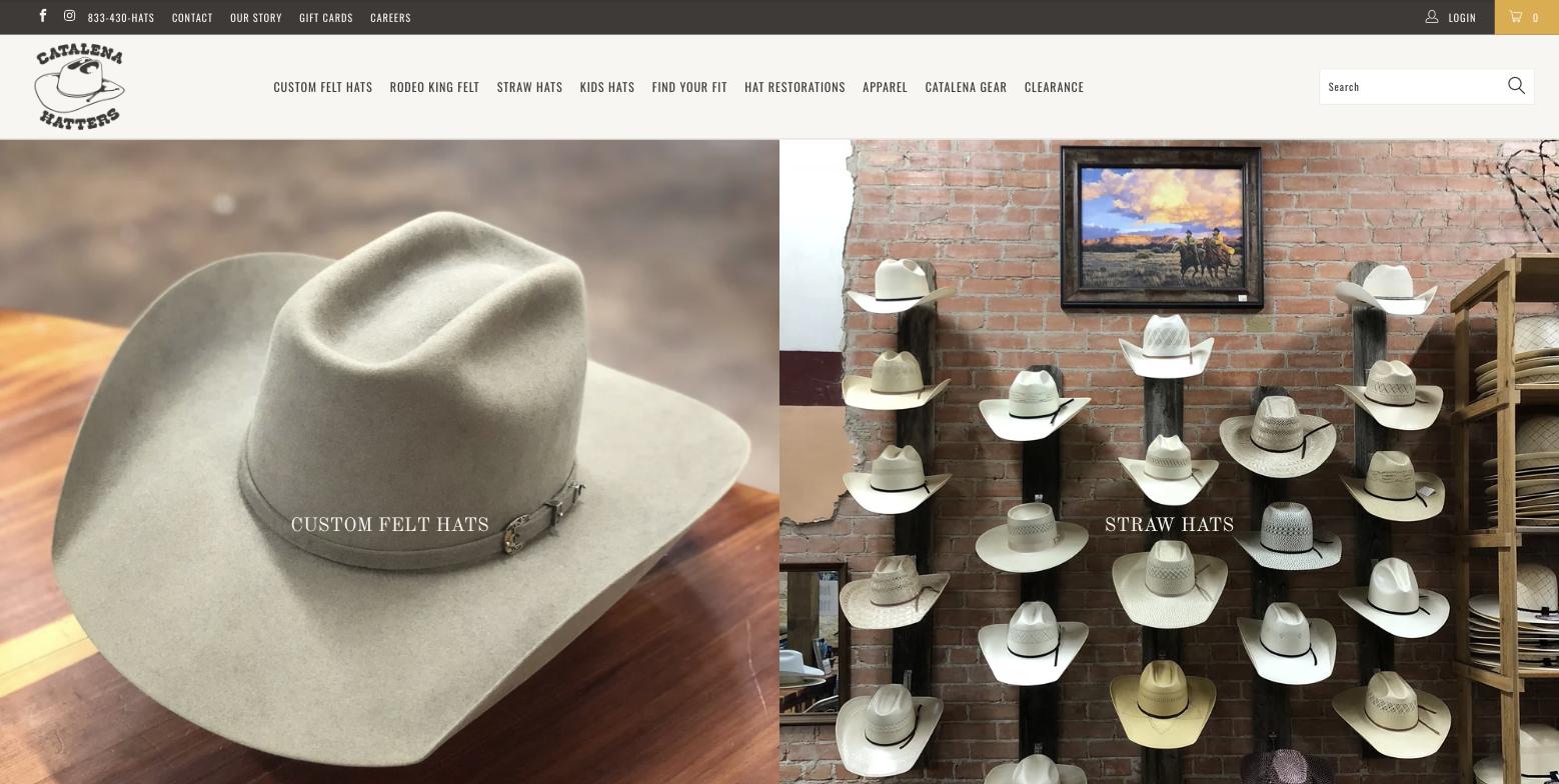
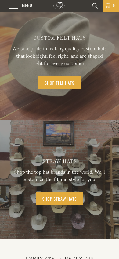
01 desktop hero and 25 mobile hero The desktop hero has no headline, no copy and nothing to click
Desktop visitors see two photo panels with 22px labels reading Custom Felt Hats and Straw Hats. Mobile renders the same slides with a paragraph and a gold Shop Felt Hats button. The desktop hero is the only screen most visitors see before deciding whether to scroll, and it carries no value proposition at all. The page's H1, "By hand. One at a time.", sits three screens down. On first load the panels also stay blank cream for three seconds or more while the slideshow script paints the images.
Fix. One slide. A headline such as "Custom felt hats, made by hand in Bryan, Texas since 1983", a one-line subhead, a primary button to the felt hats and a secondary to restorations. Preload the hero image.
-
Live site 1.91 to 1 text, 2.07 to 1 button
from $389.00
View hat color guide
With the AA tokens 4.9 to 1 text, 6.2 to 1 button
from $389.00
View hat color guide
Rendered live with the design-system tokens, not a screenshot The brand gold fails contrast everywhere it is used
Prices, links, breadcrumbs, the guide links on the product page and the white label on every gold button are set in the same gold. On cream it measures 1.91 to 1. White on the gold button measures 2.07 to 1. The darker hover gold reaches 2.35 to 1. The muted grey used for secondary text reaches 2.8 to 1. WCAG AA asks for 4.5 to 1 on text and 3 to 1 on large type. Prices are the most important number on a store page and they are the least legible text on the site.
Fix. Keep the bright gold for large fills and rules. Use the darker gold text token for anything you read, and ink on gold for button labels. The specimen on the left shows both side by side.
-
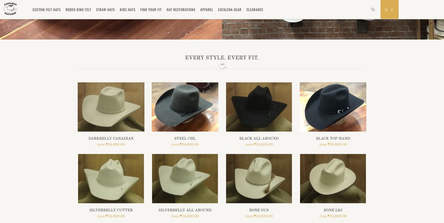
02 featured products The type scale is too small for a premium product
Section titles are 22px, product names 15px, the nav 13 to 14px. On an 1800px screen the hero labels are visually smaller than the navigation. The only large type on the homepage is the 42px banner headline three screens down.
Fix. Three display steps, roughly 48, 32 and 22px, with a 28 to 36px hero headline on desktop. Raise the base body size from 15 to 16px.
-
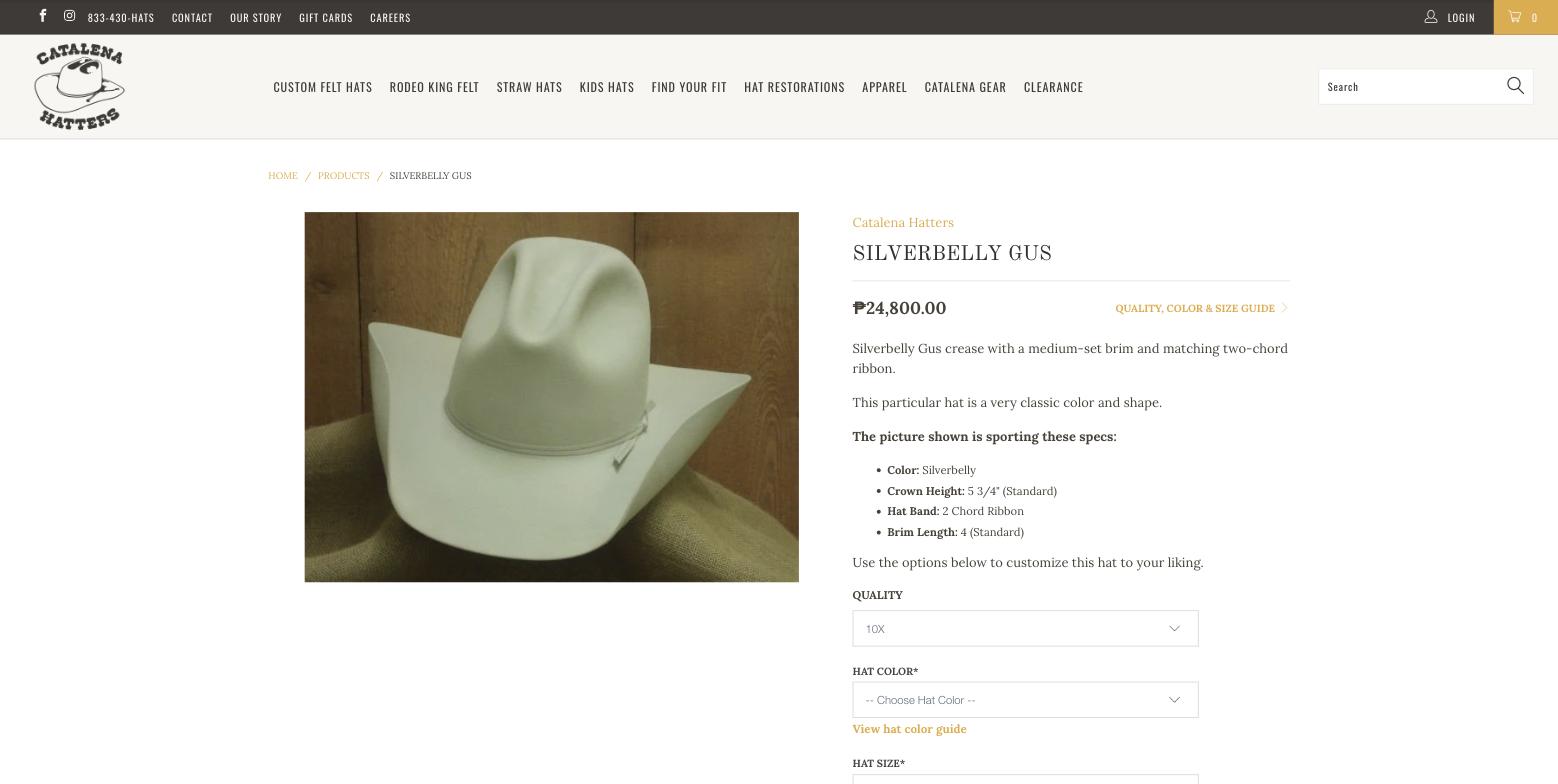
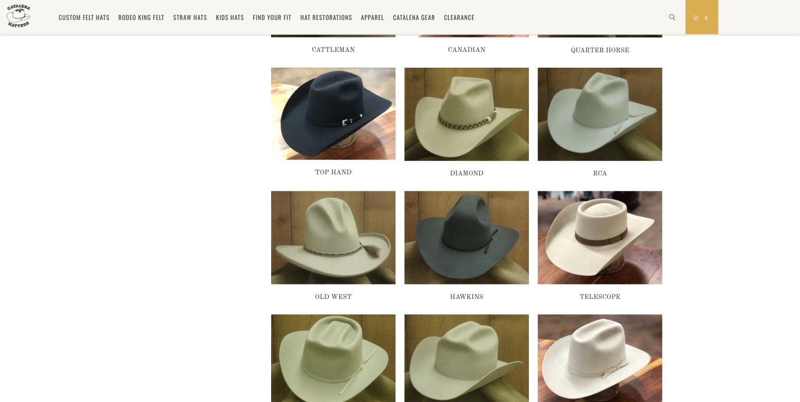
14 product page and 10 collection grid Product photography is inconsistent and low resolution
Backgrounds alternate between wood panelling, burlap and a polished table. Camera angle, crop and colour cast change from card to card. The main product image is 571 by 428 pixels and is displayed at 571 wide, so there is no zoom headroom. The 20X variant image is 320 by 240. Grid thumbnails upscale from 100-pixel placeholders and stay blurry until the swap. Every hat has exactly one photo. A buyer spending $389 to $999 expects crown, brim, band, sweatband and on-head views.
Fix. A photography standard: one seamless background, three-quarter front, profile, crown, detail and lifestyle, 2000px square, consistent lighting. Felt styles first, then straw.
-
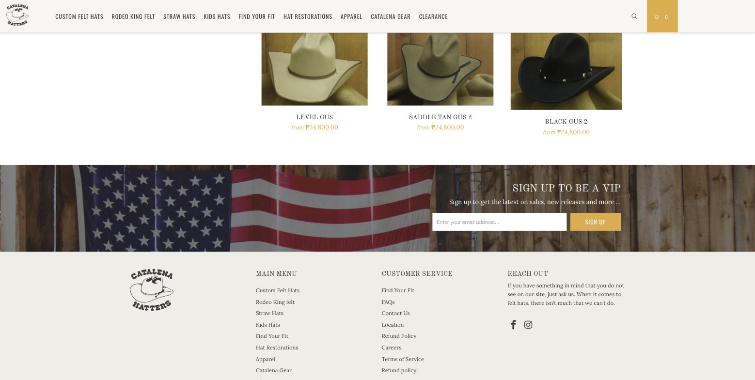
13 Gus collection, scrolled Collection and product pages leave a blank third of the screen
The filter sidebar ends after about 500px. The remaining 2,800px of the page keeps a blank 30 percent column on the left while the grid scrolls past it.
Fix. Make the sidebar sticky, or move the filters into a bar above the grid.
-
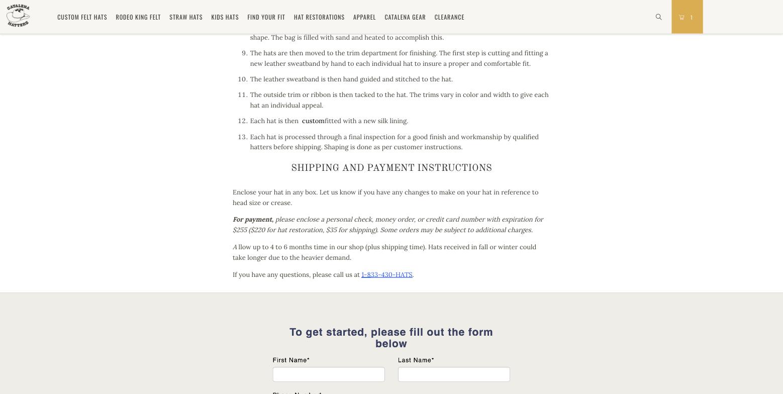
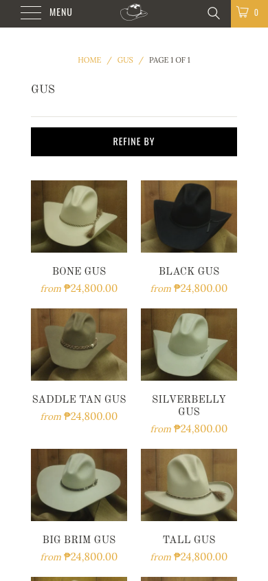
20 restorations page and 32 mobile collection Four button styles and two typefaces the system does not own
Gold filled for Add to Cart and Sign Up. Gold outline for View All. Black filled for Refine By on mobile. A default blue underlined phone link on the restorations page. A system-styled Choose File control on the product form. The HulkApps intake form arrives in its own sans-serif. Each app brought its own look and nothing reconciled them.
Fix. Define primary, secondary and text buttons once and override the Bold, Boost and Hulk styles in the theme CSS.
-
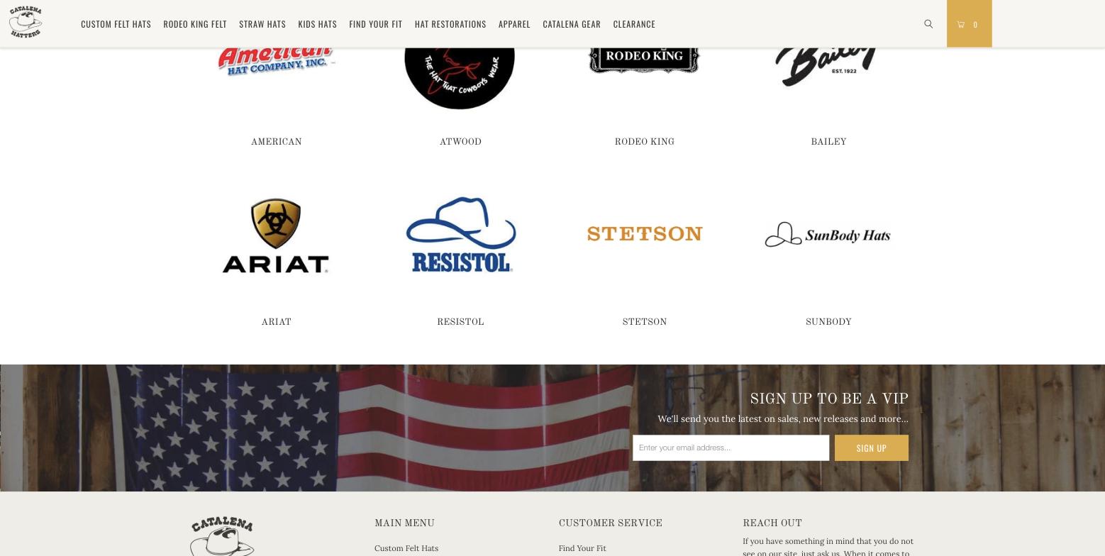
07 brand logos and newsletter The brand strip and the newsletter band fight the product photography
Eight third-party logos at their native sizes and weights: Ariat huge and black, Stetson a thin orange wordmark, Bailey cropped. Below them the newsletter sign-up sits on a US flag photograph, and that same band repeats on the collection pages, the product page, the cart and the 404.
Fix. Set the logos to one height in equal boxes, or use text links. Give the newsletter a quiet footer block and drop the flag.
-
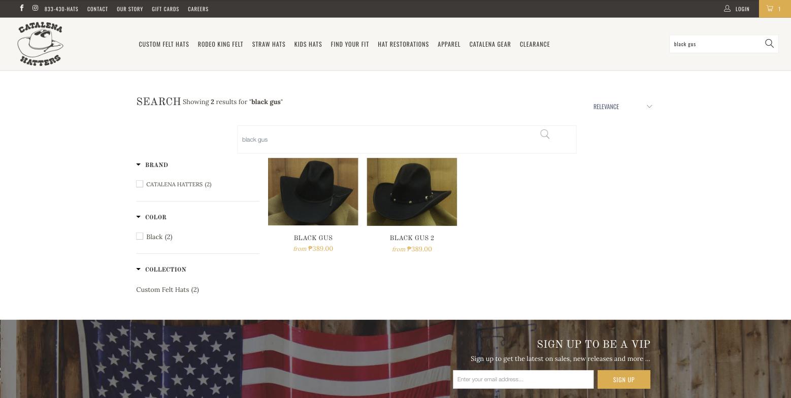
18 search results The search page has two search boxes and a heading that runs into its own count
The page title and the result count share one line. A second full-width search field appears directly below the header's search field. The sort control floats to the far right on its own. The price bug in these results is covered under Experience.
Fix. One search field, a normal collection layout, and the count on its own line.
-
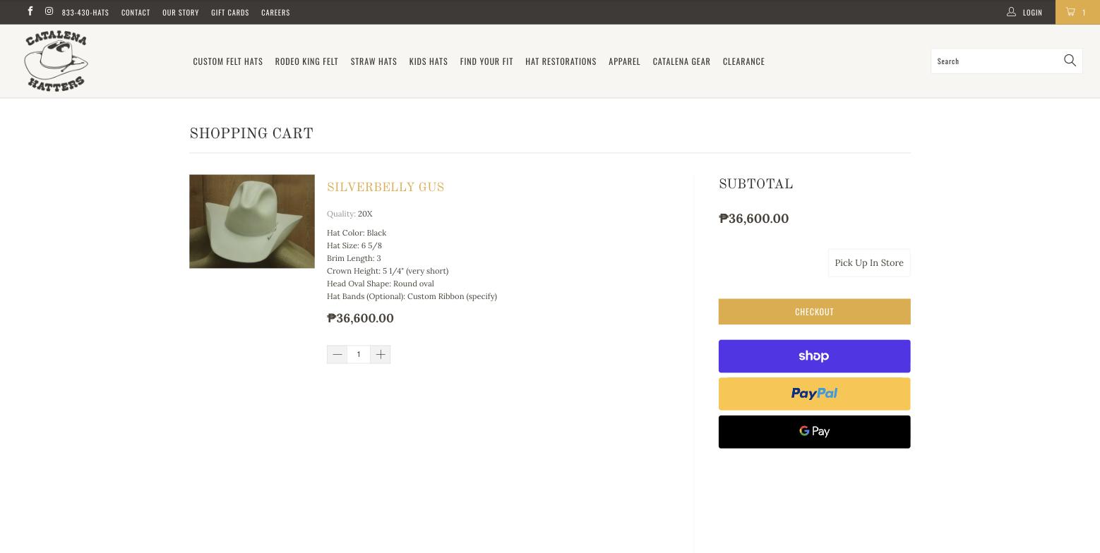
17 cart The cart shows a silverbelly hat for a black order
Colour is a Bold option rather than a variant, so the line item keeps the default photo whatever the buyer chose. The options print as plain grey lines. Pick Up In Store floats above Checkout with no explanation, and the desktop layout leaves most of the row empty.
Fix. Upload one image per colour and map it to the selection. Label the pickup control and move it under the address step.
Experience
A shopper's path from the homepage to the cart, on desktop and on a phone. The custom-hat configurator is where the business lives, and it is the least supported page on the site.
Homepage
- No value proposition above the fold on desktop. Visitors scroll three screens to reach the workshop banner.
- The featured grid shows twelve felt hats, all priced from the same number, with the style name as the only difference. No hover state, no quick view, no explanation of what a Gus is next to a Cattleman.
- Social proof is one unattributed quote from "Amy B." No review count, no press, no rating. The Shopify Product Reviews app is still referenced in the markup but renders nothing; Shopify retired it in 2024.
- No shipping, returns, lead time or guarantee appears anywhere except the policy pages. The phone number in the top bar is the site's one trust signal.
- The homepage is 5,689px tall on desktop and 5,271px on a phone. The two full-bleed bands are 800 to 1,050px each.
Navigation and structure
-
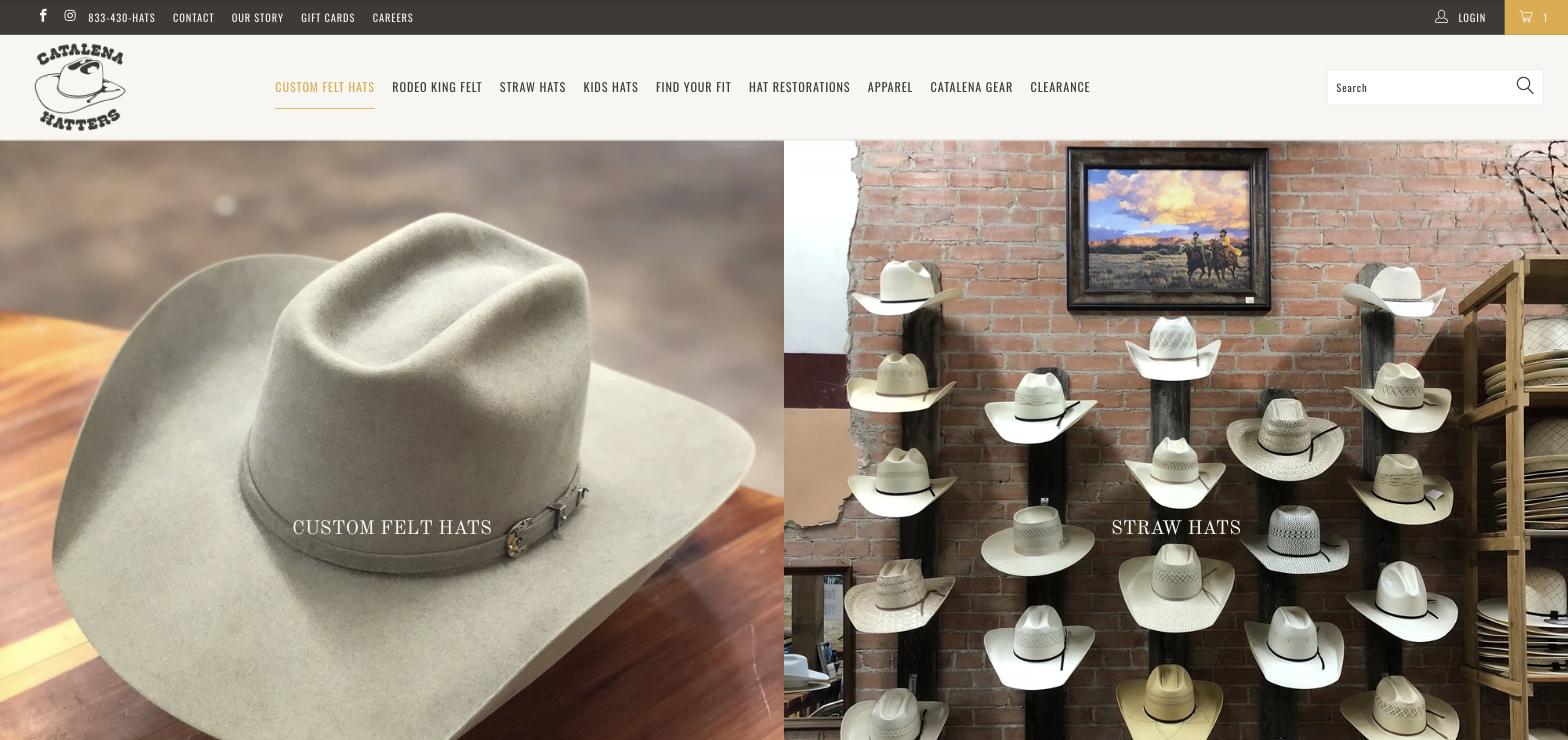
34 nav hover The desktop dropdown never opens
The markup holds a 21-item submenu under Custom Felt Hats, from Gus to Charlie Waite. Its list is set to display none and no hover rule shows it. Two seconds of hovering produces an underline and nothing else. Shoppers cannot discover a single style from the navigation.
Fix. Either restore the dropdown, ideally as style tiles with photos, or remove the dead markup.
-
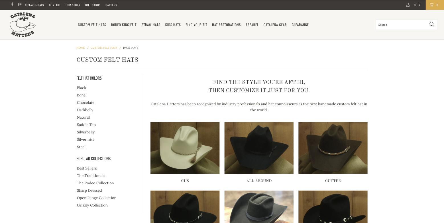
09 felt hat hub Three clicks to a felt hat, through a hub that shows no prices
Custom Felt Hats opens a hub of 21 style tiles. Each tile opens a style collection. Each collection opens a product. The tiles carry no price and no description. The breadcrumb reads Page 1 of 3 although no pagination renders; pages 2 and 3 exist and are identical. On the product page the breadcrumb reads Home, Products, Silverbelly Gus, so the style context is lost again. The nav label Find Your Fit opens a page titled Felt Hat Guide, and a quiz results page exists in the sitemap with no quiz linking to it.
Fix. Put "from $389" and a one-line crease note on every tile, or make the hub one filterable grid of all 53 felt hats. Align the nav label with the page title.
Collections
- Style collections use Boost filters for colour and collection with counts. That works. Sort is missing on collections and present only on search.
- Cards show image, name and a "from" price. No swatches, no customisable badge, no alternate image, no quick add. Names like "Saddle Tan Gus 2" and "Black Gus 2" read as duplicates.
- On a phone the grid is two columns with 140px images cropped square from 4 by 3 sources, so brims get cut.
- Most collections have no description text. Straw Hats, Gus, Clearance and Kids each have zero words, so nothing explains a 10X against a 100X or a Gus against a Cattleman.
Search
-
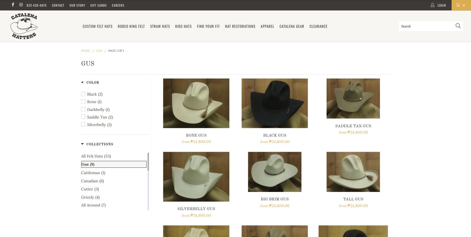
18 search against 12 collection, same hat Search prices a hat at ₱389 that the collection prices at ₱24,800
Boost search renders the US dollar amount with the visitor's local currency symbol. Shopify Markets converts the collection page correctly. The same Black Gus therefore appears sixty times cheaper in search than on the shelf. For any shopper outside the United States this reads as a broken store.
Fix. Turn on Boost's Markets currency support, or switch off automatic conversion. Then confirm the US dollar view from a US session.
Product page and the configurator
-
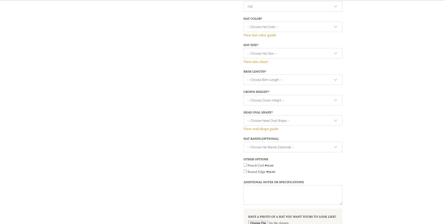
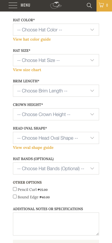
15 option form and 31 mobile form Twelve fields, six of them required, none of them pre-filled or explained
Eight dropdowns, two checkboxes, a notes box and a file upload. Six dropdowns are required and open on a "Choose" placeholder, even where the copy above states the pictured values, such as a 5 3/4 inch standard crown and a 4 inch standard brim. Choosing 20X quality moves the price from ₱24,800 to ₱35,000 with no explanation of the tiers. The colour, size and oval guides are links that leave the page, and the selections with them. Choosing Black changes nothing on screen. On a phone the Add to Cart button sits 1,961px down, about two and a third screens, with no sticky bar.
Fix. Three steps: quality as four cards with price and fur blend, fit with an inline size guide, then style pre-filled with the pictured standards. Colour swatches as images. A live summary line and a sticky Add to Cart on mobile.
| Finding | Evidence | Impact |
|---|---|---|
| No lead time or production time anywhere on the page or in the cart | No occurrence of "weeks", "lead time" or "made to order" in the body text | Expectation gap and support load on a four to six month product |
| No shipping, returns, guarantee or "handmade in Bryan" block near the price | Absent on desktop and mobile | Trust at the decision point |
| No reviews or ratings | Retired Shopify reviews app in the markup, nothing rendered | No social proof for a $389 to $999 purchase |
| One product image, 571px wide, no thumbnails | Screenshot 14; 20X variant image is 320 by 240 | Low confidence, no zoom |
Native Add to Cart hidden and replaced by a Bold clone; theme throws reading 'is_fixed' on load | Browser console on every page | Fragile checkout entry |
| Vendor link above the title leads to a vendor collection | Screenshot 14 | Noise above the product name |
| Related items are six hats at the identical price | Screenshot 16 | No cross-sell of bands, cases or brushes |
Cart and checkout
- Add to Cart navigates to the full cart page. Acceptable for a single hat; a drawer would help accessories.
- Options are listed but cannot be edited. A buyer who picked the wrong size removes the line and rebuilds twelve fields.
- No continue shopping link, no shipping estimate, no lead time, no security note. Pick Up In Store appears above Checkout without context and only matters in Bryan.
- Shop Pay, PayPal and Google Pay are present. Good.
- On a phone the checkout button is 42px tall and about 940px down the page.
Content pages
-
20 restorations payment The restorations page asks customers to mail a credit card number
The thirteen-step process is clear and worth keeping. The payment instruction asks for a check, money order, or a credit card number with expiry enclosed in the box. That is a card-data exposure and a trust problem in the same sentence. The turnaround is stated as four to six months, the phone link is unstyled blue, and the intake form below uses a different typeface.
Fix. Sell a restoration deposit as a product, or send an invoice link after intake. Style the phone link and the form.
- The Felt Hat Guide is the best content on the site: quality tiers, a size chart, colours and head shapes with an anchor sidebar. It should live inside the product page and be linked from every collection.
- The About page says "over thirty years". The shop opened in 1983, so that is 43 years. It also contains empty H2 and H3 tags and no photos of the makers.
- The FAQ page runs about 230 words and answers nothing about shipping, lead time or returns.
- The contact page carries the address in body copy only, with no map and no hours.
- The News blog is in the sitemap with zero posts.
- The 404 page is fine: search box, link back to shopping.
Accessibility
| Check | Result |
|---|---|
| Landmarks | No main, no nav, two header elements, no skip link |
| Contrast | Fails on gold text and gold buttons, see D3 |
| Tap targets on the mobile homepage | 32 of 72 visible controls under 44px; social icons are 17 by 16 |
| Image alt text | Every image has an alt attribute; five to seven empty per page, all decorative |
| Forms | Bold selects are labelled; the header search has a placeholder only |
| Overlay | accessiBe loads but its config returns 404, so the widget does nothing. An overlay would not be a fix anyway |
| Focus | Browser defaults only; check visible focus on gold buttons |
Performance
In-browser measurements. Confirm against Search Console and PageSpeed Insights before quoting them.
| Metric | Home, desktop, warm | Product page, desktop | Product page, mobile |
|---|---|---|---|
| Time to first byte | 136 ms | 313 ms | 35 ms |
| DOM content loaded | 615 ms | 463 ms | 292 ms |
| Load | 961 ms | 1,110 ms | 362 ms |
| Requests | 288 | 248 | not measured |
| Script tags | 68 | 68 | 68 |
| DOM nodes | not measured | 1,315 | not measured |
| Layout shift observed | not measured | 0 | not measured |
- The server is fast. The cost is in the browser: 68 script tags and 250 to 290 requests per page from Bold, Boost, accessiBe, Hulk, Meta, GA4, shop.app, the pickup app and the theme itself.
- No image on any page tested uses lazy loading, and none carries width and height attributes. The hero is painted by script, so the largest contentful paint on a phone is likely well past 2.5 seconds.
- The Google Fonts request is malformed: an empty family followed by Old Standard TT twice and Lora twice.
- Console errors on every page:
Cannot read properties of undefined (reading 'is_fixed'),Cannot read properties of null (reading 'parentNode'), the accessiBe config 404 and Shopify monorail fetch failures.
Search
What Google can crawl, understand and rank. Shopify covers the plumbing. The store's own titles, descriptions, structured data and content are where the work is.
Crawl and indexing
| Check | Status |
|---|---|
| robots.txt | Standard Shopify. Blocks cart, checkout, account and filter traps. Sitemap referenced |
| XML sitemap | Index to products (212, 207 with image titles), collections (50), pages (16), blog (1 URL, 0 posts) |
| HTTPS | Pass. HTTP to HTTPS 301, www to bare domain 301, HSTS, upgrade-insecure-requests |
| Canonicals | Self-referencing on every page tested; collection-scoped product URLs canonicalise to the product |
| 404 handling | Returns a real 404 |
| Meta robots | index, follow everywhere; nothing accidentally hidden |
| Internal links | First 40 checked all returned 200; Shopify rate-limited the rest. Re-run at one URL per second |
- Duplicate paginated hub pages. The felt hat hub at page 2 and page 3 is indexable, self-canonical, and renders exactly the same 21 tiles as page 1 because the section hides the products. Noindex pages two onward or render the products.
- Thin utility collections are indexable: all, frontpage, home-featured, types, vendors. The all collection has no meta description.
- Duplicate collections: grizzly, grizzly-1 and grizzly-collection; rodeo-king and rodeo-king-felt; charlie-waite-hats beside the product charley-waite. Consolidate and redirect.
- Brand collections for Resistol, Stetson, Ariat, Twister, Sunbody and Bailey exist as URLs. Check they hold products or noindex them.
Structured data
No page carries JSON-LD. This was verified in the rendered DOM, not just the static HTML, so it is not a script-injection blind spot.
The theme still emits 2018-era microdata: Product and Offer with price, currency, availability and brand on the product page and on every thumbnail, plus BreadcrumbList. That puts twelve Product entities on the homepage and seven on a product page, which dilutes the main one. Image, SKU, description and rating are absent, and the item types use plain http URIs.
There is no Organization, no LocalBusiness or Store with the Bryan address, phone, hours and coordinates, no WebSite with a search action, and no FAQPage.
What to add
- Product with Offer: price, priceValidUntil, SKU, an image array, brand, return policy and shipping details
- BreadcrumbList that follows the style collection
- Organization plus LocalBusiness: 203 N. Main Street, Bryan, TX, phone, hours, Facebook and Instagram
- WebSite with a SearchAction
- FAQPage on the FAQ page once it answers real questions
- Remove or trim the thumbnail microdata
Titles and descriptions
| Page | Title | Description | Issue |
|---|---|---|---|
| Home | Catalena Hatters - Custom Felt Hats, Straw Hats, Felt Hat Restoration (69) | 128 chars | Truncates in results; typo "located a Bryan, Texas"; no call to action |
| collections/custom-felt-hats | Catalena Hatters – Custom Felt Hats (35) | 154 | Brand first; identical title and description to pages/custom-felt-hats |
| collections/all | Products - Catalena Hatters (27) | none | Thin page, no description |
| products/silverbelly-gus | Silverbelly Gus - Catalena Hatters (34) | 320, truncated | No category words such as custom felt cowboy hat |
| products/7104-para-panama-3 | 7104 - Catalena Hatters (23) | 191 | SKU-only title |
| pages/felt-hat-guide | Felt Hat Guide - Catalena Hatters (33) | 320, truncated | Description is the first paragraph cut mid-sentence |
| pages/faqs and blogs/news | FAQs / News - Catalena Hatters | none | No descriptions; the blog is empty |
| pages/about-us | Catalena Hatters - About Us (27) | 190 | Too long |
- In a sample of twenty product pages: four SKU-only titles (7300, 1022, 7800, A73122), fifteen descriptions over 160 characters, four duplicates across straw hats sharing "This hat can be shaped however you like", two with no description, three under 70 characters.
- The title format alternates between "Brand – Page" with an en dash and "Page - Brand" with a hyphen.
- Pattern to adopt: colour, style, "Custom Felt Cowboy Hat", brand for felt; brand, model, "Straw Cowboy Hat", crown and brim for straw. Hand-written descriptions of 140 to 155 characters with the fur grade, Texas and a reason to click.
Headings
- On the homepage two H2 hero labels precede the H1, which reads "By hand. One at a time." three screens down and carries no keyword. Footer column titles are H5 and H6.
- The About page contains an empty H2 and an empty H3.
- The product page H1 is the bare style name, and the guide sections repeat the guide page's H2 and H3 blocks inside every product page.
- One H1 per page otherwise, which is correct.
Content
- Collections have no words. Straw Hats, Gus, Clearance and Kids carry zero description text; Custom Felt Hats carries one sentence. Each needs 150 to 300 words on crease, brim, who it suits and the quality tiers, with links to the guide.
- Product descriptions run 40 to 70 templated words. Straw hats reuse one paragraph. Add fur or straw grade, crown and brim measurements, band, sweatband, weight, the made-to-order note and care.
- The blog is empty. How to measure hat size, felt against straw by season, 10X to 100X explained, how to shape and clean a felt hat, restoration before and after, rodeo crease guides. Each links to the configurator.
- Local. Customers drive two and a half hours to the shop, per the homepage testimonial. Add the address and hours to the footer, LocalBusiness data, a Google Business Profile link and a map.
- Authority. The 1983 founding story is strong, but there are no maker profiles, no press, no customer photos, and the About copy is stale.
Images
- Every image carries alt text and the product alts are descriptive. Good.
- No lazy loading, no intrinsic dimensions, little srcset. Product masters are 571px or smaller, which is too small for Google Images, Shopping and retina screens.
- The homepage social image is the logo on a cream pad. Collection and product social images use http URLs at 600px. The Twitter card is the small summary type. Use 1200 by 630 hat photos and the large image card.
Technical debt
- Turbo 2.0.10 from 2018 with Bold Product Options v1 and the retired Shopify Product Reviews app. An upgrade brings native lazy loading, image dimensions, sections and removes around thirty legacy scripts.
- accessiBe's config returns 404 and the theme throws two JavaScript errors on every load.
- Shopify Markets currency conversion is paired with a search app that does not read Markets, which is the source of the price mismatch.
Action plan
Ordered inside each group. The critical group ships on the current theme; the long-term group is the theme move.
Critical
This month
- Product page and cart trust block: production lead time, shipping, returns, handmade in Bryan, phone number.
- Contrast fix for gold text and buttons. Theme CSS only.
- Desktop hero headline and buttons, in the theme editor.
- Fix Boost search currency rendering and verify the US dollar view.
- Remove the mailed credit card instruction on the restorations page; replace with a deposit product or an invoice.
- JSON-LD for Product and Offer, BreadcrumbList, Organization and LocalBusiness, WebSite.
High impact
Next quarter
- Photography programme: all 53 felt styles first, then straw.
- Rewrite titles and descriptions for 212 products and 50 collections; write the collection copy.
- Configurator redesign: stepped, pre-filled, inline guides, live price line, sticky mobile Add to Cart.
- Reviews: a current app such as Judge.me or Okendo, import Google reviews, add rating data.
- Noindex thin and duplicate collections and the paginated hub; consolidate duplicates with redirects.
Quick wins
Days
- Fix "located a Bryan"; change "thirty years" to since 1983; remove the empty headings on About.
- Footer: address and hours, one Refund Policy link, a label on Pick Up In Store.
- Match the Find Your Fit label to its page, and either show the 21-style dropdown or delete it.
- Repair the Google Fonts request; add lazy loading and dimensions to grid images.
- Remove or fix accessiBe; fix the two theme JavaScript errors.
- Meta descriptions for the all collection, FAQs and the blog; hide the blog until it has three posts.
Long term
Two to three quarters
- Move to Turbo 9 or an Online Store 2.0 theme, replacing Bold v1 with native variants and a current options app.
- Content programme: two guide posts a month tied to the configurator, plus a restoration before-and-after gallery.
- Measure: Search Console Core Web Vitals, the GA4 funnel from product page to checkout, and drop-off per configurator field.
Screenshots
Every capture the findings refer to, in page order. Desktop at 1800px in Chrome, mobile at 390 by 844 in Chromium. Click any one to open the full file.
Desktop hero: two photo panels, 22px labels, no button01 Featured grid, identical from prices in gold02 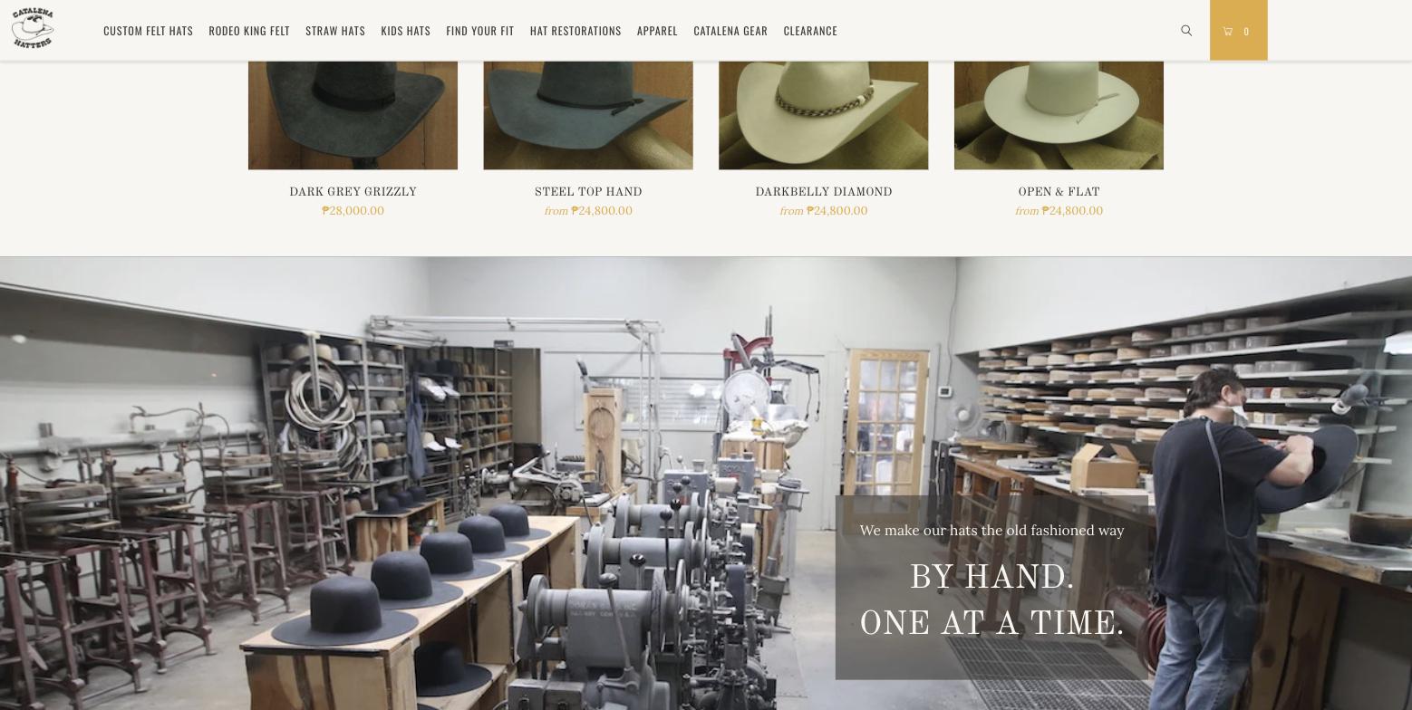
Workshop banner carrying the page H103 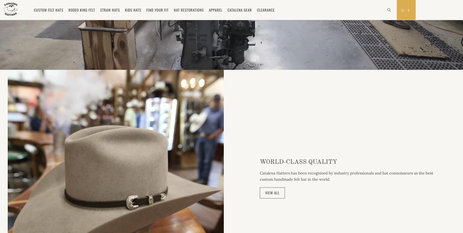
Quality block with an outline button04 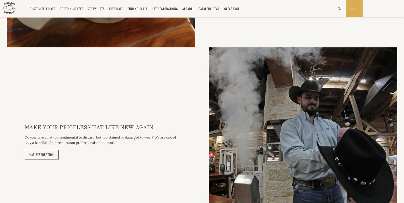
Restoration promo block05 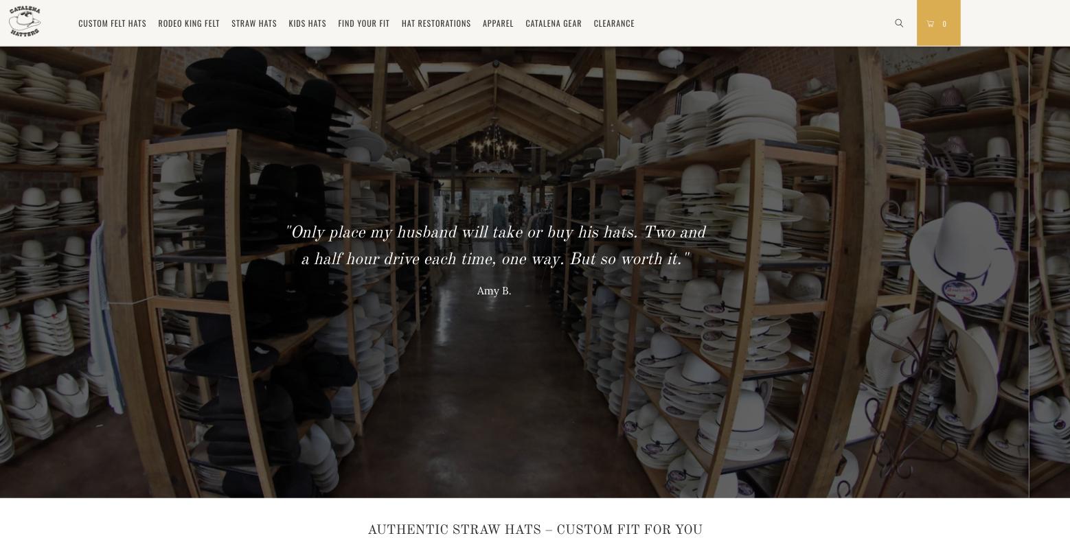
Single unattributed testimonial06 Uneven brand logos and the flag newsletter band07 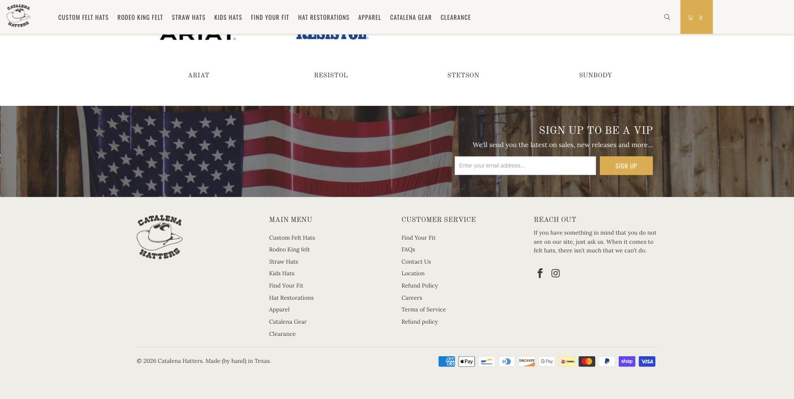
Footer: duplicate refund links, no address08 Hub page: Page 1 of 3 breadcrumb, tiles without prices09 Blurry placeholders, empty left column10 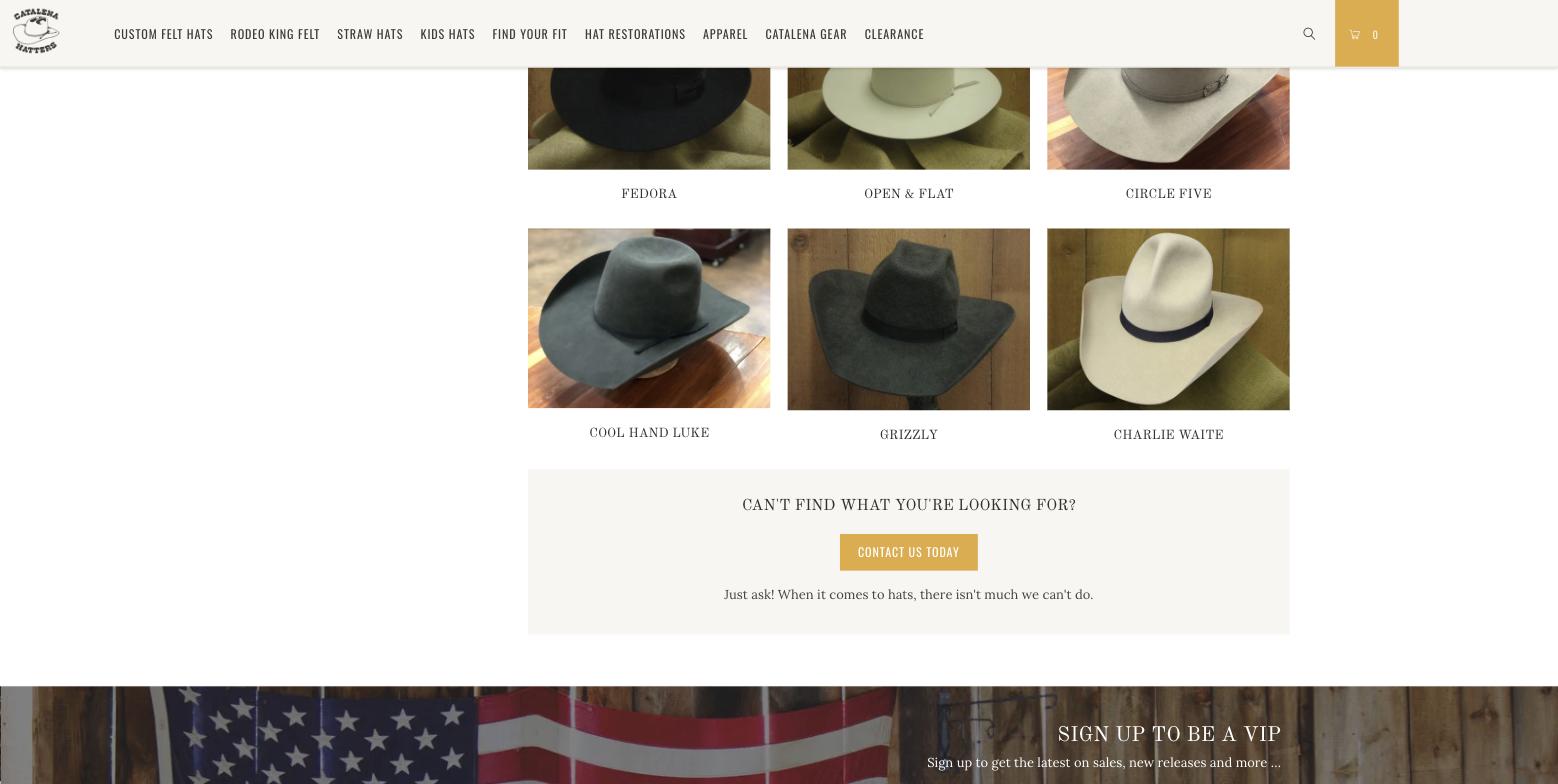
Hub footer prompt to contact the shop11 Style collection with Boost filters12 Empty sidebar column on scroll13 Product page: one 571px image, vendor link14 Configurator, all placeholders15 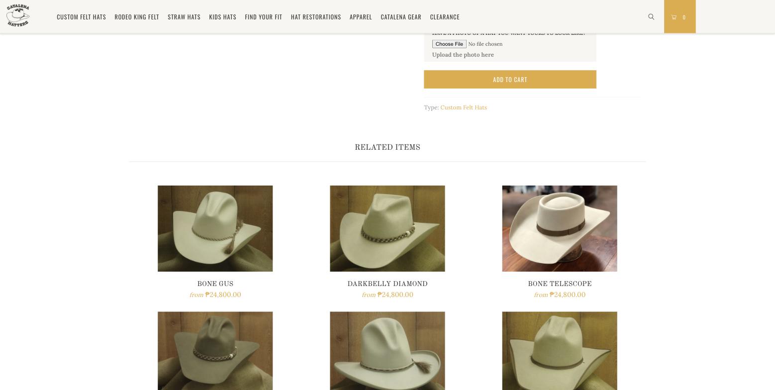
Add to Cart, upload and related items16 Cart: uneditable options, wrong colour image17 Search: ₱389 currency bug, duplicate search box18 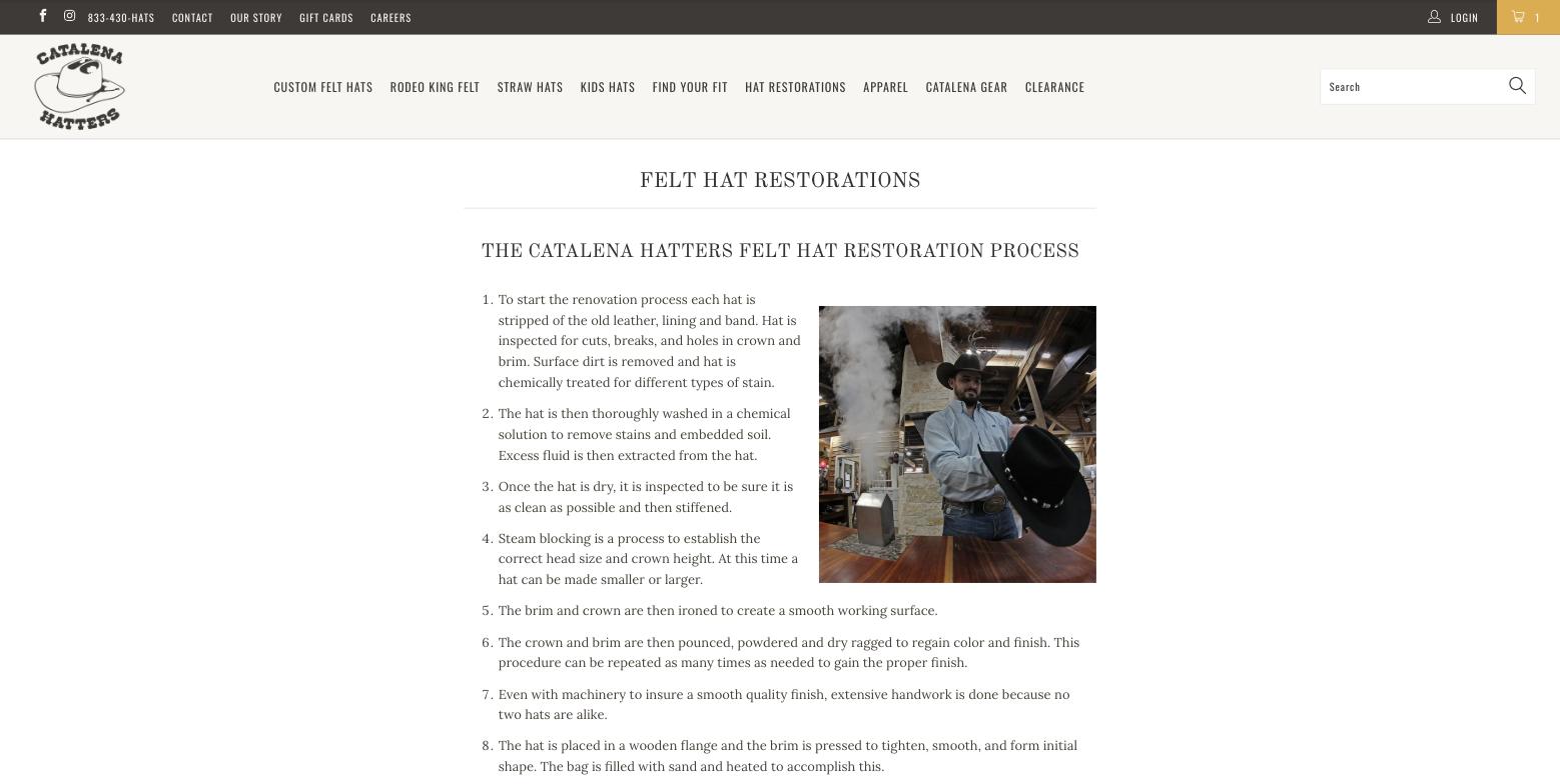
Restoration process content19 Mailed card number instruction, blue phone link, Hulk form20 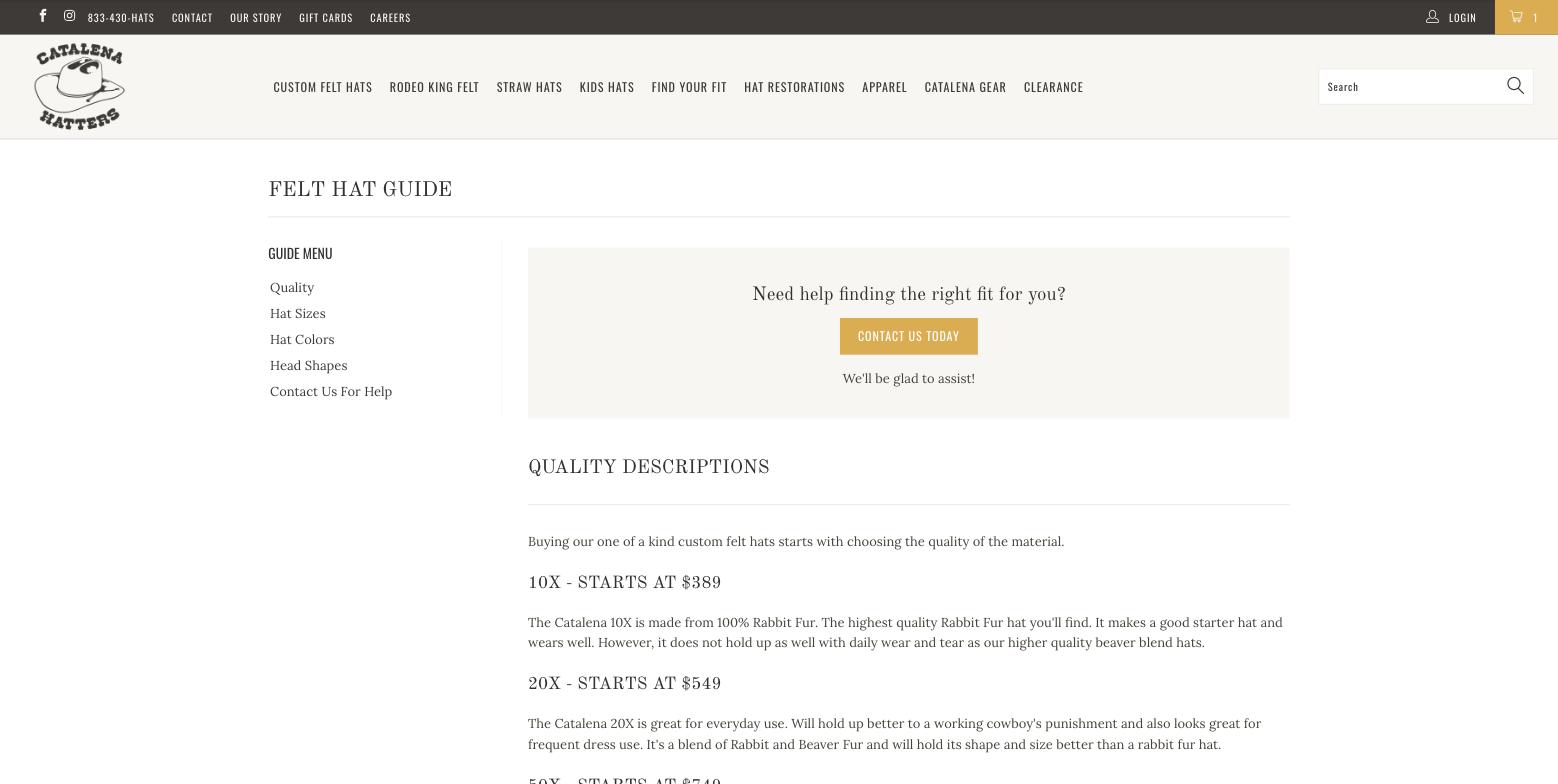
Felt Hat Guide, reached from the Find Your Fit link21 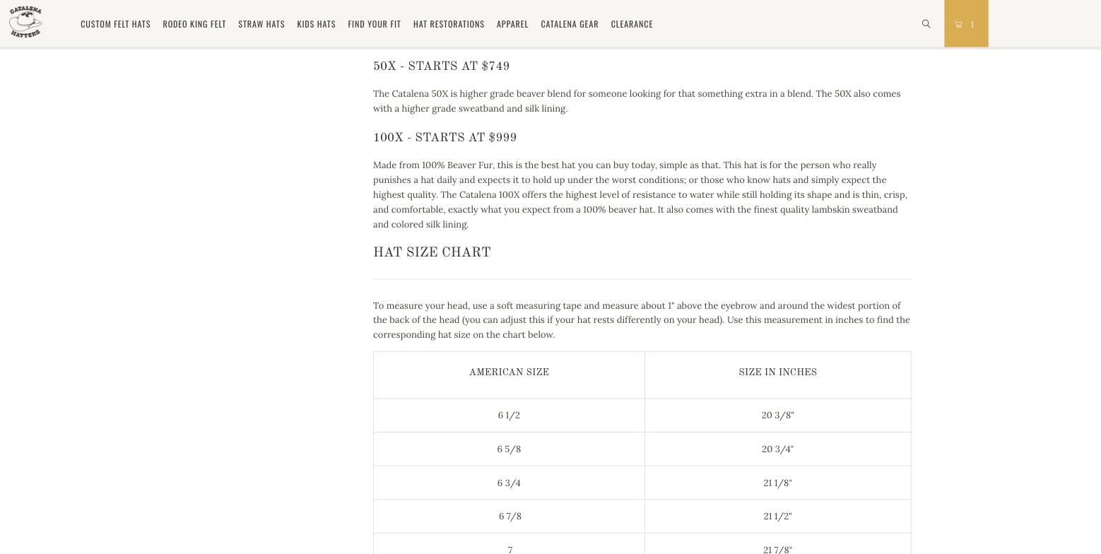
Size chart table22 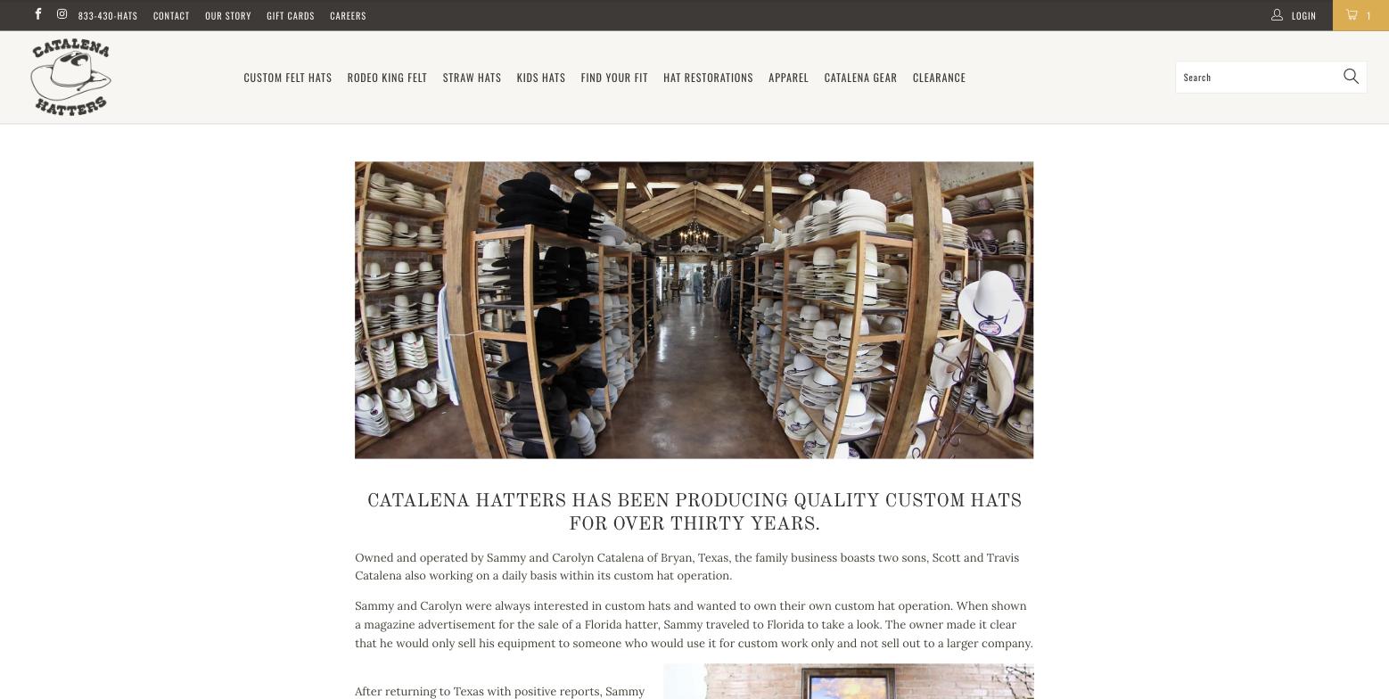
About page, "over thirty years"23 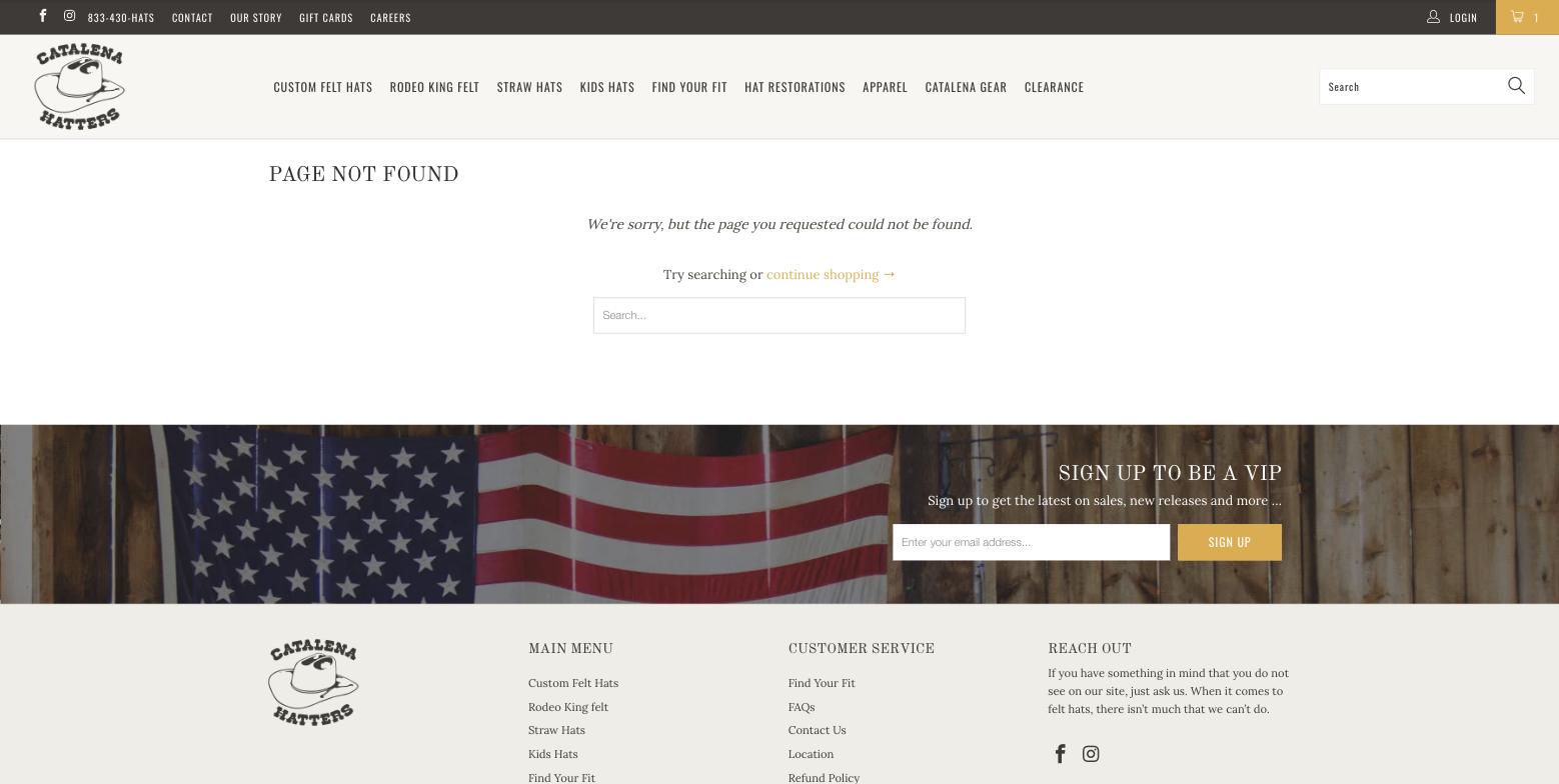
404 page24 Mobile hero with copy and a button25 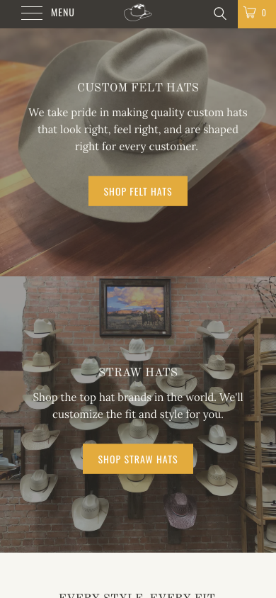
Mobile product grid27 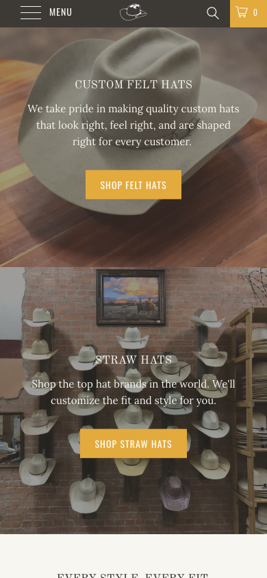
Mobile footer28 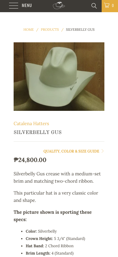
Mobile product page, 300px image29 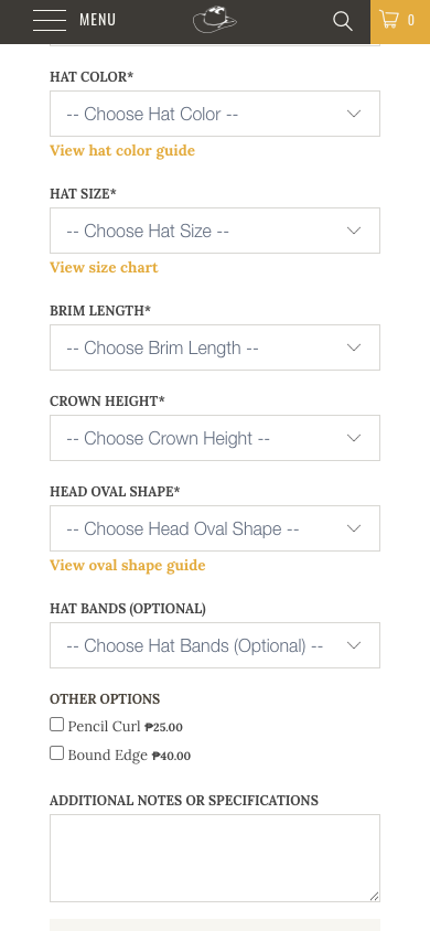
Mobile configurator30 Add to Cart about 2.3 screens down, no sticky bar31 Mobile collection: black Refine By, two columns32 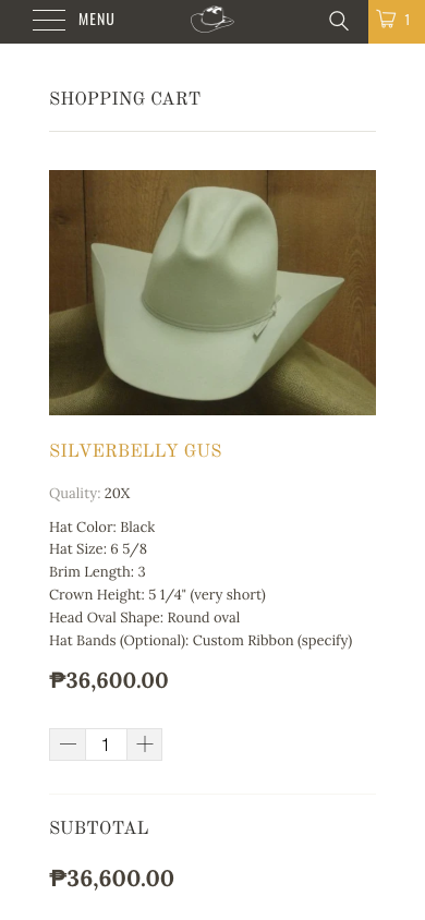
Mobile cart33 Nav hover: underline only, submenu never opens34